Nicholas Studios
Thursday, August 18, 2016
We're free!
Well, now that we've gotten new gmails I can do whatever I want on this blog, it feels good knowing I have a place to give out my thoughts. I'm still in G.T. But we've gotten e-mails from the high school because we use their server. But since I used my own personal e-mail for this blog, they have no power over me or what I say, so we can do what ever we want. Other news, Officially a seventh grader, school started a while back, maybe three weeks? Anyways, click here for my new blog if you want to see my school stuff.
Sunday, August 7, 2016
Music Video Finale
(This one's unfinished, but I kept I felt like giving it to you)
My gosh, has it been an amazing school year, that's right, this is the last of the school blog posts until I'm officially a seventh grader at Kapaa Middle School, it seems exciting and I hope it is. Let's hope I remember to write a tally on my 'hype' paper, cause that's how I feel right now. Anyways, I'm getting off track here, for our last project we need to create a music video using several shot types, and pleasing visuals in a fast pace rhythm to showcase all of the skills we have learnt this year. For example, our ability to create photoshop images, or edit in I movie. The song my team chose was the first two minutes of "Stayin' Alive" by the BeeGee's. My team for this project were Gillian and Alex. So, in the story Gillian wants to climb a tree, which Alex and I don't want her to climb, as we don't want her to get hurt, but the song is "Stayin' Alive", so it would relate by saying we want her to well, stay alive.
Right now at this point in time, my favorite 'montage' we have in our video would probably be the part where Gillian is climbing and Alex and I are changing expressions quickly as she climbs. I just really liked the hilarious expressions Alex made when we were filming.
This project is supposed too showcase our skills that we've learnt throughout this year, and it has. We're able to create photoshop intro and blooper (not necessarily blooper) graphics. We can also use our knowledge of different shot types and our knowledge on how to use iMovie. That's how this project allows for all of our knowledge.
Thursday, May 12, 2016
Animated Life Lessons
 |
| Jhoanna working |
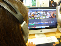
We started to use humor by using stupid graphics, like having Jho split her legs in mid air. That isn't what we're supposed to do however, I just thought it was funny. Anyways, we used humor as much as possible while still keeping a serious story. I feel we achieved it, maybe you would disagree. I think we did absolutely fine, but I respect your opinions.
 |
| Katy working as well Jhoanna is in the background. |
 |
| The world always needs more Katy |
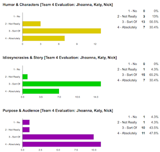 So my team has never worked together before, and oh baby, was it horrible. We were super extreme struggling with this project for so many reasons. Firstly we took a really long time arguing about noses on the script. It was a real struggle (Insert struggle is real meme). Luckily we were allotted more time to do our project. If not for this, I think we would've failed. Thank the heavens that we got an extension. Anyways, I'm getting off track, the best moment I thought, was when we were all animating, as we were very productive. So hope you enjoyed this post, and I'll see ya' later!
Wednesday, April 13, 2016
My Addiction to Games
Hello, welcome back, hope you all had an amazing day. So today I'm talking to you about video games! I enjoy all sorts of games, whether it be a story rich game, or an action shooter, I love games. I personally (not in person) would love to meet up with other gamers online. So feel free to comment, or message me somehow and play some games!
Friday, April 8, 2016
Character Development
 YES!!! It has come, we're doing animation in class! This is a dream come true, you don't know this, but I've wanted to do animation for years now. But anyways, dreams aside welcome back, so in class our project is puppet warp animation, and we need to like make an animation with a team and include our personal traits and stuff like that as indicated from the title. So here I am in this paragraph talking about myself an relatable/humorous imperfections. I would describe myself as a person who's relatable to most, and enjoys people liking me. I also consider myself a person who helps so much, I can't get a really amazing dazzling grade myself.
The character trait I plan to exaggerate is the helping part. I feel like a way I could do this would be too help the friend I'd have (Whoever it may be) to get super amazing at the skill they're learning but I'd still not be the best. If I can do this that would help alot, so I don't need to rethink. Also one note, the animation isn't so much about the animation quality, but more of the story esc animation, according to mister Sanderl. If I were you, wouldn't expect a dazzling performance and and animation quality, as It's the first time for all of us doing puppet warp animation.
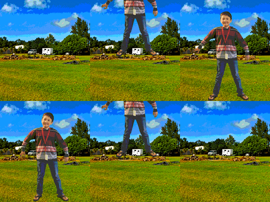
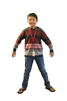 The first thing we had to do in order to create our .GIF was get photos of ourselves on a green screen. then we had to get those photos and put them into photo shop and use the quick selection tool, which allows us to select areas of contrast and quote cut them out. Once we have all that done, we use the puppet warp tool and select points on our bodys to make sure the points we select don't move unless we want them to. Then we just kind of make our figures do what we want to do. We also need to create new layers in photoshop for every movement we make. So, that's this weeks post, and I hope you enjoyed it, so see ya' later!
Friday, March 11, 2016
.MOV Film Festival
So, now we are getting into film making and actually are going to put our movie trailer/sitcom/animation depending what you chose into a film festival! So we have some chosen keywords: Differences Rivalry Understanding, and we thought these would connect with our audience well for multiple reasons. First of all we thought differences would connect with our audience well, because every person in the world is different, there is no same person especially with genders (Not in a gross way). Also I forgot to tell you our theme, Well our theme is about these four kids two boys and two girls, One is myself, one is Ashley, Brody, and Mele. Secondly for rivalry tons of people have had rivalries in their life at least once or twice, and that's like our main theme in general. Lastly understanding; there have been tons upon tons of times where I judged something and I didn't really understand it, it's quite a common thing and that's the whole ending about understanding and stuff.
As any good film makers we needed to have change, or learning for our characters, or some sort of implied message, so we do. Our characters have two of these, the boys in the situation experience learning when they get beaten/proven equal to the girls they understand girls can be equals and fair rivals. Also our message is about how no one gender is necessarily stronger than one another in any certain way as most things are. Those were our message, and change for our characters.
 It was a bumpy road getting our filming done, and we had a few challenges along the way. One of the biggest challenges we faced was the fact that most of the time, we could hear the AC unit or there would be a generator running. I understand this is inevitable, as we were at a school (The Kapaa elementary) filming this so some buildings still needed power. This could have been easily avoided but we were just kind of lazy and didn't refilm and just chose to mute it. So that was the story of our film making process, hope you enjoyed it, and I'll se you all in the next post!

As any good film makers we needed to have change, or learning for our characters, or some sort of implied message, so we do. Our characters have two of these, the boys in the situation experience learning when they get beaten/proven equal to the girls they understand girls can be equals and fair rivals. Also our message is about how no one gender is necessarily stronger than one another in any certain way as most things are. Those were our message, and change for our characters.
 It was a bumpy road getting our filming done, and we had a few challenges along the way. One of the biggest challenges we faced was the fact that most of the time, we could hear the AC unit or there would be a generator running. I understand this is inevitable, as we were at a school (The Kapaa elementary) filming this so some buildings still needed power. This could have been easily avoided but we were just kind of lazy and didn't refilm and just chose to mute it. So that was the story of our film making process, hope you enjoyed it, and I'll se you all in the next post!
Monday, February 22, 2016
Tiny Spherical Worlds
 |
| Polar 1 |
WARNING!!!
This entry has more images than ever before
You can create some pretty crazy stuff using composite imagery, but what's the point why not just have one image? Well for starters we wouldn't have nice panoramas with all those photos creating a long scene. For seconds I wouldn't be writing this blog post because we are creating a spherical panorama and polar panorama. Continuing on spherical panoramas would not exist because they require multiple images. Anyway, the world wouldn't have the same famous artists or the same creative minds.
 |
| Panorama for The Spherical |
 |
| Spherical Portrait |
The polar and spherical panoramas are very similar as they are a rotated panoramas. However there are many differences as well, polar panoramas need to turn it 180 degrees in Photoshop as is not the case with spherical panoramas. As well as the fact in spherical panoramas it appears as if the sky is trapped in a tube, in polar panoramas however it looks as if it is a planet in space. Also another thing that is different is the fact that in a polar panorama it matters if there is a tree reaching for the heavens, as you are trying to create a planet in space but with a spherical panorama it's OK if there is a tree reachin' straight in to the center because it's supposed to be more of a tube as seen in the images.
 |
| Spherical 1 |
 |
| Polar Portrait |
The things that make our little tiny worlds convincing would be the fact that we blend sky colors and making a realistic transition. Also the main thing that ruins a polar panorama is the line that is created and is almost like a barrier and just creates because we do not create 360° panoramas. Also as seen with the portraits they are very surreal, and include shadows. Finally there's just a really nice blend of colors and scenery that's created when doing this it makes it look like a real place or a realistic planet or tunnel. So that's it for today sorry this took an extra week, this was a extremely long project, hope you have an awesome next two weeks, until we meet again.
Subscribe to:
Comments (Atom)

